
Better Automation for File Transfer with WinSCP
Want to create your own automation scripts for file transfer? With a few tips, you can get better automatin with an FTP client like WinSCP Read More
Published on 21 Aug 2019
Your business’s email newsletter design can either help or hinder the delivery of important company information, despite your best efforts. Some customers may actually be waiting on features announced in your newsletter. Announcements can be missed due to poor formatting, readability issues, or bad taglines that make the email look like spam.
We recently did some reflection on our newsletter and concluded that we could do better. We decided to take some time to improve our newsletter design, an effort led by Erin, our Marketing Manager. Read through our journey towards an improved newsletter. Then take the six steps she’s outlined back to implement with your business.

How many email newsletters are you subscribed to? Is your inbox filled with 20+ emails you instantly delete? What makes you stop and open an email that isn’t work-related or from a personal contact?
For a lot of businesses, building amazing newsletters is a focus as an email newsletter can improve sales, leads and brand awareness.
What made us decide to modernize our newsletter, and how did we go about the process?
First, we’d just finished a big update to our product interface and our brand. Our developers worked hard to create a new modern web interface with a sleek design and intuitive, easy to locate features for file sharing. With a new look and feel for our product, it only seemed right that we would carry that over and similarly update the newsletter.
Second, we looked at our data. Our goals were higher than what our stats showed. The numbers were telling us that improvements could increase open rates, clicks, and newsletter engagement.
A newsletter is an integral piece of the puzzle when updating your SaaS product because it is one of the ways you present new features to your clients.
As a SaaS company, our product is continually evolving. Our newsletter is a communication tool, updating clients on improvements to our service. Kind of a sneak-peek at what’s new within the service that you might not yet know exists.
Presenting a newsletter with a modern, appealing design helps promote sharing of your brand and product. As we provide quality information along with company and product updates, current customers may share and talk about us with others. If we are writing great articles for our blog or posting new videos on YouTube, those can be leveraged in a newsletter as helpful and informative content.
Step 1: Competitor Research.
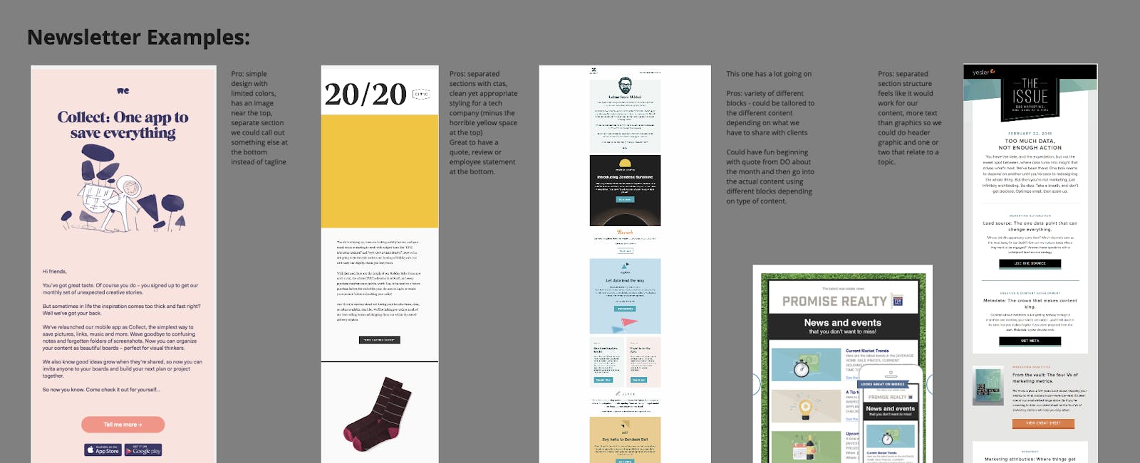
Finding quality newsletters is more than a simple Google search away. We began finding companies that had appealing designs on their website and blog. We decided to focus on competitor blogs and newsletters as well as other SaaS companies outside our niche. Then signing up for a variety of newsletters. As the newsletters began to arrive in our inboxes, it truly hit us that ours had room for improvement.
We initially liked newsletters from:
Asana – Their newsletter has a bold block style. It has simple styling and art with lots of colors. Asana also produces additional content to link to so they can provide a small snippet in the newsletter and rely on that to make you click the CTA in each block to read more.
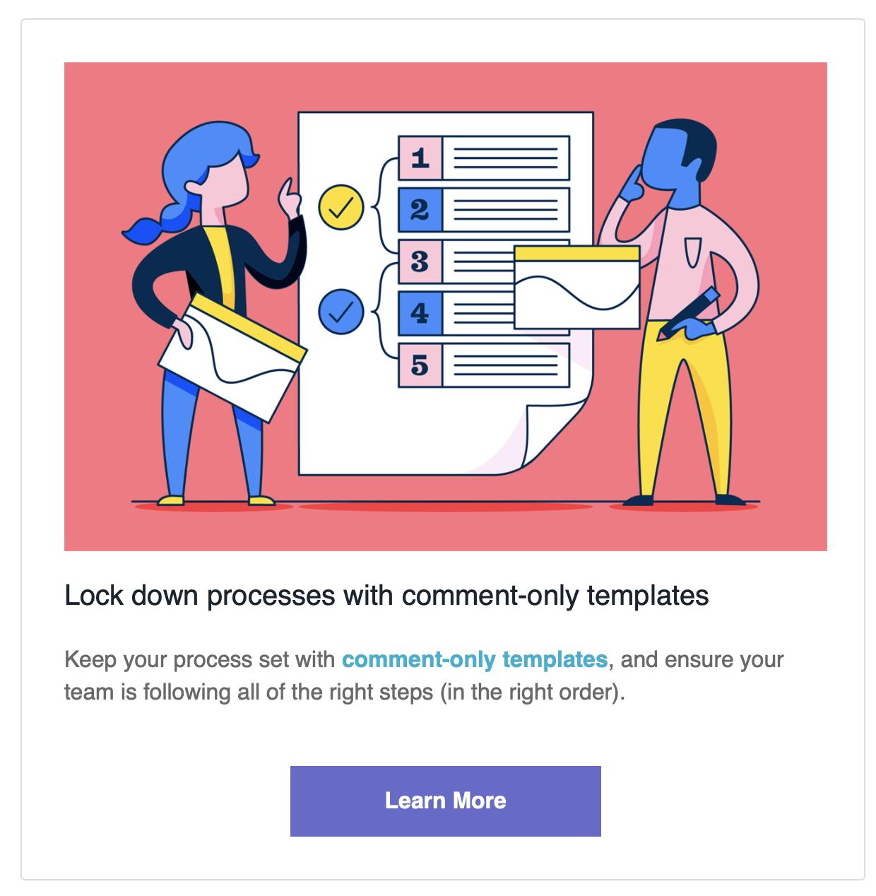
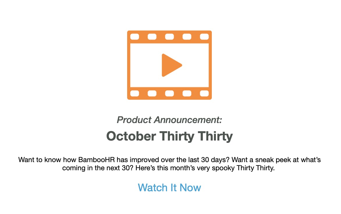
BambooHR – Our CEO loved the Thirty/Thirty concept (what we did in the last 30 days and what is coming in the next 30.) If you get their newsletter, you’ll usually see a big, bold image at the top. We liked the idea of something eye-catching right off the bat.
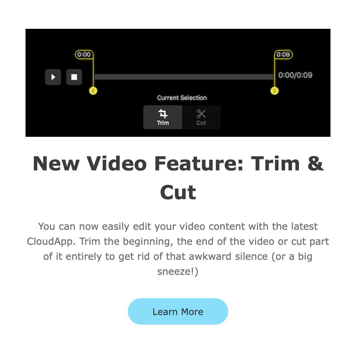
CloudAPP – This one was another basic layout with separated blocks. Each block featured an image, headline, text snippet, and call to action button. All of these were elements we were drawn to and put on our wishlist for the updated email newsletter format.
Initially, I reviewed our current process and tools for creating the newsletter. I wanted to be familiar with the tone, style, and content used in previous newsletters. This included reviewing the following:
The first thing I noticed was that our previous newsletters were heavy on written content. Text-heavy content was probably the norm years ago when companies started sending content emails. Newsletter emails used to be the most common way to disseminate product information and news to clients. There weren’t as many ways to add graphics, and not everyone had a blog with new content to link to every month.
Next, there were a few styling things that stood out. Links back to our site were posted directly in the body of the newsletter, not linked using anchor text or with a CTA. And NO linkable images. The colors were also limited. Not in itself detrimental to a company’s image, but the colors were black on white with the company bright blue sprinkled in for headings. This type of palette with nothing to break up the text can be jarring on the eyes.
Finally, we considered the overall layout. We had basic paragraph formatting with full-width images. Compare that to the modern block styling of the three newsletters we talked about earlier.
Step 2: Make Decisions.
So we knew we needed to update our newsletter format, and decided now is the time.
Would the things we liked in other newsletters work for us?
We had to think about our content — what we want to share in a newsletter. As well as what would be feasible from a design standpoint.
In this phase of the project, we began to formulate an idea of what we wanted. The buts came next.
The Thirty Thirty is a great idea. But, what if we can’t always commit to having multiple things updated each month. Often our projects are more significant and take longer to fully design and implement. So, it could be two months before we are ready to share a new feature with the world.
Bold colors are great and grab attention. But, do we want to add a bunch of random colors to our company color palette? Do we spend the time to A/B test colors? Should we just pick one or two colors we like? Do we try to find a creative way to work with our existing set of colors?
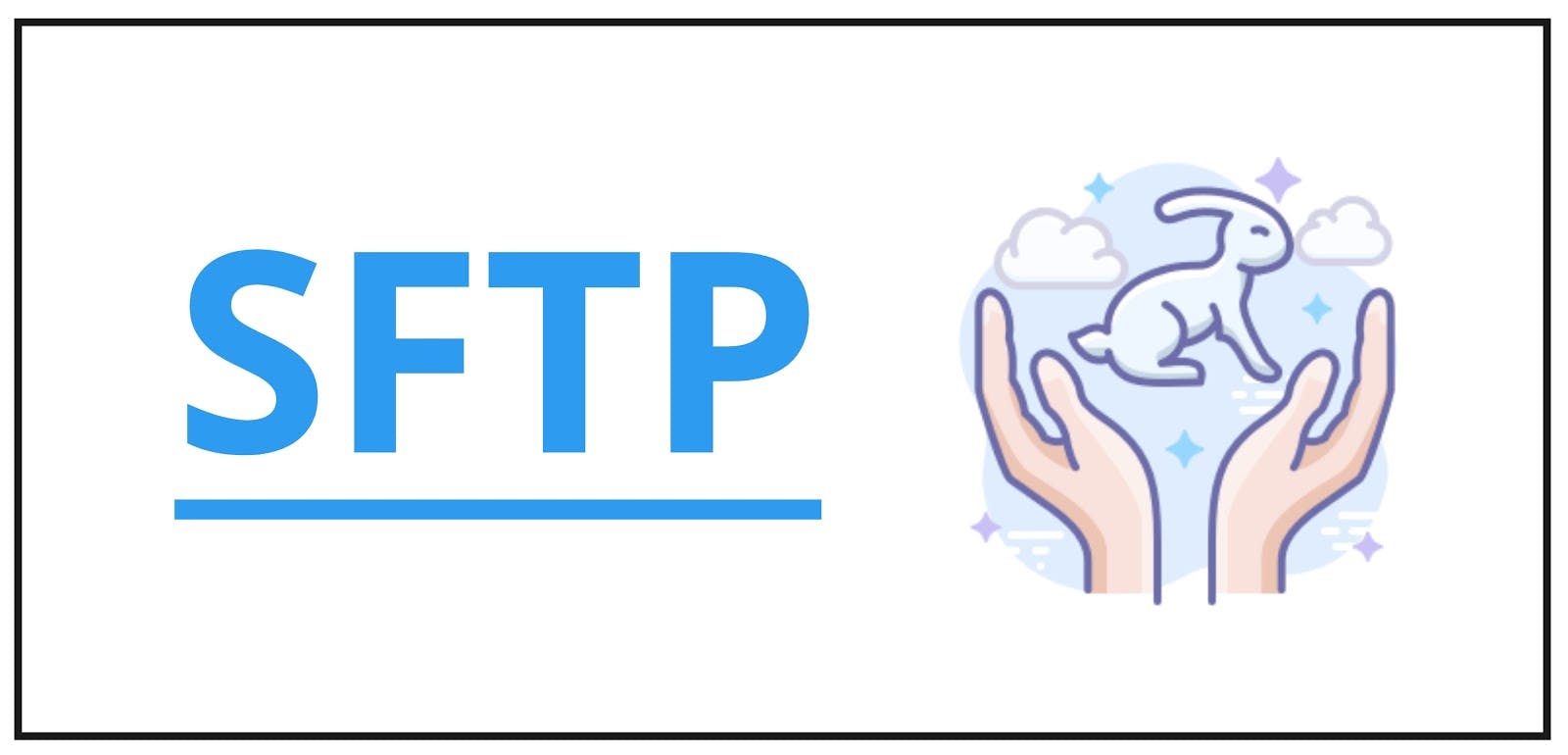
We love the idea of more images! But, creating image assets can eat a lot of time. Plus what type of images come to mind when you think SFTP and business file transfer?
As we are creating more content online – blog posts, feature blogs (like this one), tutorials and how-to videos, we could easily break out our newsletter into various sections. Sections that work for us and the information we have to share.
First, we did more research into newsletter best practices and top newsletters in the past year.
Then, we reviewed a lot of newsletter design layouts and compiled a few in a virtual whiteboard to use as inspiration.
Step 3: Creating Mock-Ups.
We created a board in Miro for mock ups of what the marketing team was envisioning for our email newsletter.
Previous research led us to decide on mocking up and creating a template that had modular pieces. We wanted a template that allowed for separate block styling, similar to that of many other company newsletters we looked at.
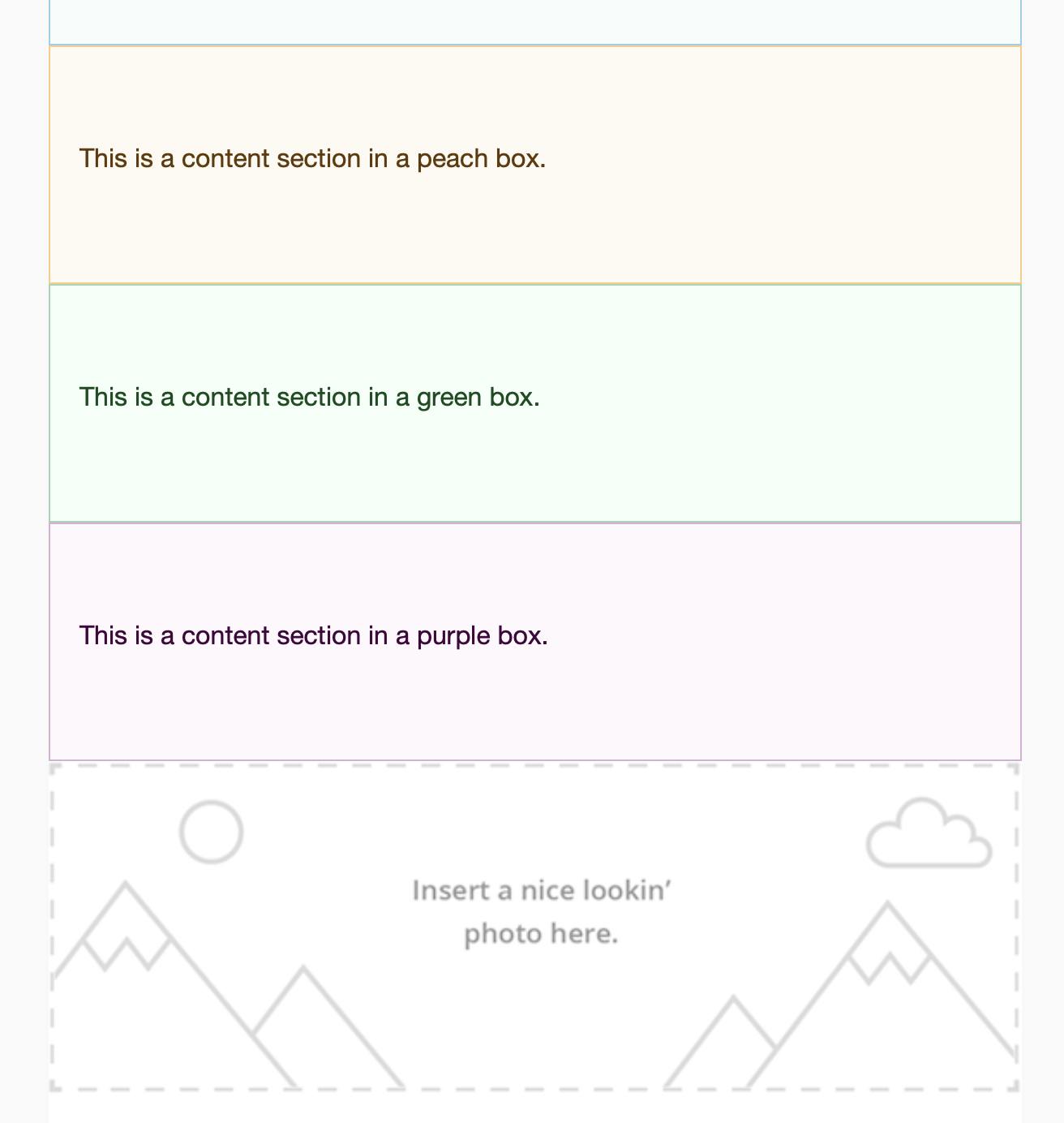
Basic block types:
Next, our mockups were shared with our design expert, Karl.
We discussed the overall concept and idea – and left it in his hands for a bit (4 full workdays.)
Step 4: Evaluating Email Clients.
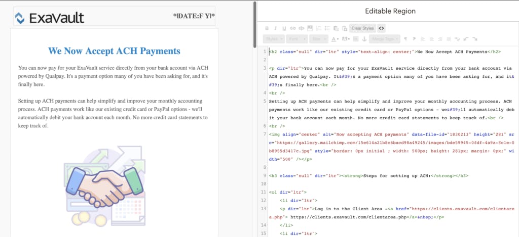
Another thing Karl did after going through our design concepts was to determine if the different elements were possible with our current email client, MailChimp. We wanted to have control of the HTML which could present challenges in turning the designs from our Miro concept board into a usable email newsletter template.
With MailChimp, you can make blocks on the template level. This was definitely a workable option. On the template, you can even create editable blocks and give them custom CSS for styling elements.
You can also have the content creator go into the HTML for the email and add custom HTML for each of the different section types. In testing, this worked and didn’t appear to break when editing around the content in the WYSIWYG editor. You can also see the CSS changes in the preview, so the person creating the email newsletter can tell if things are broken.
If the functionality you are looking for to achieve your design goals are not available with your current email client, there are a host of other options you can check out. In addition to Mailchimp, some of our recommendations would be to evaluate the following:
Step 5: Formatting a Newsletter Draft in MailChimp.
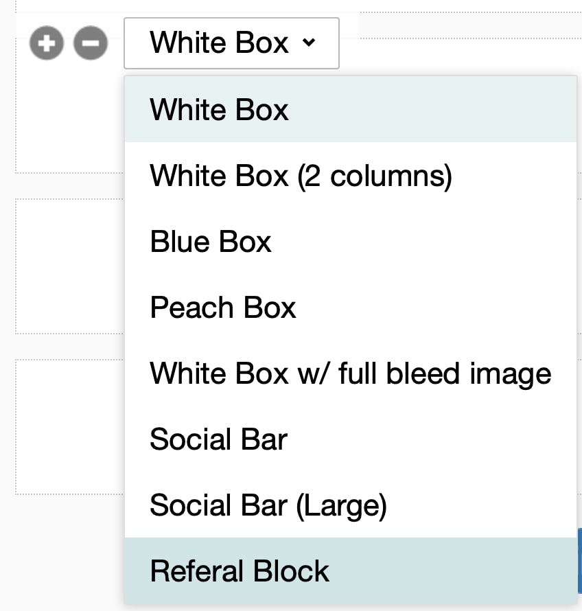
First, add a new block. Then change the block style. We decided to start with several basic block types. More block types can be created and added to the list in the future if we find we are missing something that would be useful to the content we share via email. There can be multiples of any block type, and you can arrange them in any order under the header block.
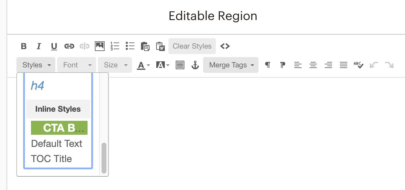
The CTA is under styles in the editor, not a block style choice. You can’t add a call to action until you are in the editable region for the block – even though Karl showed us this, it was not the most intuitive until I actually created a few CTAs.
With MailChimp, we can have different styles of content blocks. This allows for different styled sections in our email newsletters without requiring technical intervention.
Everything else was the standard MailChimp formatting stuff we’re used to. Standard editor, adding images, inserting links, headers, font, etc.
Colors and some styling pieces required a bit more teamwork to finalize.

We needed to define additional background colors besides white for blocks in the newsletter. We also wanted to have complementary colors for the hard rule separating sections within a block. Finally, we looked at our CTA – the CTA button was automatically showing up with the text underlined. The underline was not part of the desired look.
So, this particular issue was directed back to our design expert.
Karl: Ok, this is fixed. Unfortunately, there’s a sequence of events that has to happen when making CTAs so that they come out without the underline.
Type in the text of the link. “See what’s new!” or whatever.
Select the text and make it a link. Put in the URL and everything.
Then use the styles dropdown and make it a button.
(You can also fix it in the HTML, but who’s got the time?!)
Me: Must do in proper order!
We also documented this process so anyone creating an email with this new template can add CTAs properly.
Step 6: Creating & Sending an Email Newsletter.
BambooHR was the prime example we wanted to be more in line with. We loved the 30/30 concept, but how do we get the content put together each month?
We accomplish this through communication between departments and having all team members use the product. If we know our engineering team is working on creating a new feature that allows you to customize the forms you use to receive files into your account, the marketing team can ask questions and gather information to help write a blog about our form builder. Others can work on video content to show how the new feature works in the application. All this leads to multiple pieces of related content — creating a newsletter with a cohesive message.
Then, add in the different styling elements. We can have two elements separated by a distinct line or horizontal rule. One section can have a different colored background. Placing two sections side by side is another option. We can even create a clickable image taking you to our new video.
Finally, after months of work, our first newsletter with modern elements was sent. It was not only newsworthy, announcing a new product feature that many clients have been asking for, but offered more than boring text.
Redesigning our newsletter was a successful project — after we got over the technical humps. The modern template design lets us share information with clients in a reader-friendly format. We hope you enjoyed reading about the process we went through on this project.
If you’re ready to tackle updating your company’s email newsletter template, here are the six steps we used:
Need modern file transfer + secure FTP? Sign up for ExaVault!
Want to create your own automation scripts for file transfer? With a few tips, you can get better automatin with an FTP client like WinSCP Read More
Set up receive folders, customize upload forms, and integrate into your website. Read More


